Monday 19 December 2011

Graphic Novel Review - Gonzo: A Graphic Biography of Hunter S. Thompson


I chose this graphic novel because of my love for Hunter S. Thompson's work. By no means am I his biggest fan, but I love his writing style and his way with words enough to read (and re-read) as many books as I can get my hands on. So to me, this book was a must immediately.

The book's cover design jumped out at me as being very reminiscent of the Fear and Loathing in Las Vegas book cover, with a bright orange background and a sketchy illustration below. This doesn't really surprise me, as Fear and Loathing is easily Thompson's most famous book, and this is a very easy way of sucking readers of that book into reading this one - one which will definitely inform them of what a fantastic writer they have stumbled upon.


As I read the book, I couldn't help thinking that it was very well put together. The book is written as if Thompson had written it himself, and includes quotes and snippets from his various books. The writing and the snippets fit together perfectly to make a very seamless portrayal of Thompson's life, that genuinely feels true to his style. Thompson's style of writing (in my opinion) is very recognisable - he had a way to describe even the grittiest elements of society in an obscure way that seemed to make caricatures of them, which is a style I admire greatly.

In terms of illustration, I think the book's visuals complement the story well. A combination of realism and sketchiness, it relates back to the nature of Thompson's journalism - rapidly flashing from place to place, sketchy and unfinished in places.
However, I do think the monochromatic images were a bad choice. They give the book an 'old timey' feel which doesn't really suit Thompson's style as a person. The bizarre nature of Thompson's descriptions paves the way for bizarre renditions of people in bright colours and strange shapes, but this book has not played into that.

Overall, I really enjoyed this novel, as it was a really captivating insight into the life of a writer I admire. The illustrations and words have come together well to portray an immersive journey through Hunter S. Thompson's life. I can't help but appreciate this novel for what it is, as it was a joy to read, so much so I read it twice. I could definitely see this graphic novel paving the way for new Thompson fans to discover more of his great work.

Tuesday 4 October 2011

Typographic Research: Adrian Frutiger

Adrian Frutiger is a Swiss designer, said to be one of the most prominent typeface designers of the 20th century, who continues to influence the direction of digital typography now. He is most famous for creating the typefaces Univers and Frutiger. His work has spanned the hot metal (metal in poured into a mold and set, which is then used to print with), phototypesetting (shining light through a negative of a character in a font, which technically developed the font onto film) and digital typesetting eras.

The French type foundry Deberny Et Peignot recruited Frutiger and he went on to create several typefaces there. Probably his most famous typeface is Univers, which I've been working with today.


Univers was designed by Frutiger in 1954, after Charles Peignot (from Deberny Et Peignot) had been impressed by the success of Futura, which was a simple typeface based on geometric forms. Frutiger thought that instead of the regimentation of Futura, the new font should be based on the neo-grotesque model (neo-grotesque in typeface terms is defined by a regular style design with more open jaws than traditional grotesque type, and the 'g' is open tailed, and the ends of curved strokes are usually oblique). 


When Univers was released, it was classified in a table of different weights and widths. Frutiger designed this with the intention of making the classification of typefaces easier to understand. Instead of 'light', 'bold', 'oblique', etc, typefaces were given a numerical value (e.g 55), where the first digit represents the weight and the second digit represents the width and position of the typeface. All even numbers are italic. This idea never 'caught on' because printers weren't willing to change their language. 
As the Univers family extended from 21 typefaces up to 44, the numbering system extended to three digits, with the third digit representing position (i.e oblique or Roman). 


Univers has had extensive usage, and is still used in several places. It is commonly used in the UK for exams and tests, as it makes the letters I and 1, for instance, easy to distinguish. It was also used for a while by Apple for the keycaps of its keyboards, and some but not all London boroughs use Univers for their signs. 


----


These are the pieces of work I created with Univers. We weren't allowed to use computers, so we had to photocopy our fonts from type sheets, and then copy them, trace them or stick them onto our final pieces.
The first piece was created in a group, and I was responsible for the background and the word 'Inevitable'. I didn't have all the letters I needed, so I was forced to mix and match italic, regular, large, small, upper and lowercase letters. I didn't like this piece all that much, since I felt like the background wasn't very good, and the 'Univers' I had written to show which font we used seemed really strange next to our text.
The second piece is an Ansel Adams quote I am planning on using for my final piece. I created this with Univers, but this time I used the combination of different styles and sizes intentionally. I wanted to get a more chaotic feel with this piece, so I tried to make the piece feel like a ransom note, throwing lots of different ways of interpreting the type into one piece. This did, however, make the piece harder to read, in my opinion, and I'll have to look into this when I experiment more.

Tuesday 27 September 2011

Hand Job: A Catalog of Hand Drawn Type

As I've just started my new typography brief at college, it soon came to the time where research begins. My first mission was to head off to the library for books on type, and while everyone else was looking at more traditional type books, I couldn't help picking up this bizarre book.


This book is full of hand crafted type, though I can't say I'd ever heard of anyone in it, despite being a huge fan of hand drawn type! I stumbled across a few pieces that I really fell in love with, and I'm going to talk about them here.


This piece is from Dan Funderburgh. There were 3 pages devoted to his work, but this one immediately caught my eye. His colour scheme is very basic - two colours (which is always a good idea as it makes it easier to change the design's colours and makes it fairly cheap to print onto clothing), but it works very well with the type. This design would easily work with many other colour schemes, but this one contrasts the page very well and complements the other pieces on the page. 
One thing I love about type like this is the way that it frames itself. It doesn't require a box or a circle to sit in, because the lines surrounding it, or the type itself, does a good job of framing it, which makes the whole piece feel more finished, in my opinion.


These two pieces are by a collective called National Forest. They are a group of art directors, designers, illustrators and photographers, though mostly their illustration and design work appeared in this book.
I love National Forest so much. I liked their work in the book, but upon visiting their website, I was even more amazed by the vast amount of work they do for really high profile companies. They have worked with DC Shoes, Element Skateboards, Puma, Baileys and Quicksilver, and all of their work is amazingly well created and professional.

My two particular favourites from the book are above, but I prefer the left one slightly more. I absolutely adore the way the type is messy like paint, but still controlled and crafted. I also love how simple the design is in terms of colour (it demonstrates this itself by the fact it's white on a blue shirt on the NF website) so it can be transferred easily to any colour scheme or object.

The right hand image caught my eye because of the way the type had been made - with lots of little people twisted into the shapes of the letters! I thought this was so adorable, and such a good idea for writing the words 'Everybody Enjoys' since everyone is involved! The colour scheme is a simple three colour scheme, which again, would work really well in any three colours. I also love how detailed this piece is that even though there are several 'E's and 'Y's etc, National Forest have still taken the time to draw different characters as each letter, instead of just copying the same one over and over. This level of attention to detail really makes the viewer appreciate how much work has gone into the design, which is always a good thing.


These two pieces are from Andy Smith, who does typography, illustration and animation. The distressed feel of his 'Regrettably Yes' piece was what first drew my attention to him. His work in the book is extensive - he gets a whopping 6 pages to display his work on! But this space is put to good use, as all of his work is exciting and interesting to look at. All of his work has a lino-cut feel, like he has printed his piece and some of the texture of the lino has discharged onto the paper. This gives his work a more personal and candid feel. It makes me feel, personally, like I could achieve such amazing results if I sat and cut those exact letters into lino, even though I know this couldn't possibly be true.

Andy's work has such a childlike, illustrative feel that is really enchanting. He still works with a restricted colour scheme, like the previous artists I looked at, but Andy's work has a lot more of a 'beginners' feel, like he hasn't quite mastered it yet, and some colours have specks of the wrong ink on them. This just adds to the feel that the work has been handmade, which always feels more personal to the viewer.

Andy's work also has a great humour to it, which I found in a print alphabet he made called 'The Face of Disaster: An Alphabet of Mishaps':


I love the whimsical little illustrations that make up the letters. Each one is different, so the viewer has plenty to look at. While the illustrations are fairly simple, it's the little details on the print that make me happiest. In the bottom left corner is a white fingerprint, with the words 'Someone has blundered. Oops.' next to it. This gives the whole print a more human feel, and once again makes the viewer feel more involved. In a way it's very humbling to see a mistake on a piece of design or art, as if the artist is opening themselves up to you and showing you how they can make pieces that aren't that great, too. Even if this 'mistake' is on purpose, it still gives you that feeling of openness.

---

As a whole, I have seriously enjoyed flicking through 'Hand Job', which turned out to be a really insightful and inspiring book, despite its cute, cheeky name. I am dying to investigate hand drawn type further, and I'll be looking into it more later on in this project.

Saturday 25 June 2011

Chesterfield College/Winding Wheel - Fashion Show Essay


On Tuesday 21st June, I visited the Fashion Show at the Winding Wheel. This show was designed to show the work of students on the Fashion, Hair and Beauty, Textiles and Art and Design courses. Because of the nature of the show, I didn’t get to see any development work, and it was very hard to speak to the designers and artists who created the work.

This show was quite restricted in terms of the specialisms it could display. Creatives worked with fabric or hair, and usually to a theme, with not much room for expansion. There was some variation in the pieces, but they all recognisably ran on the same theme. The show was divided into projects that would be shown, so the audience could easily relate the work back to the theme it was based on, though sometimes this was quite obvious because of the work on show, or the accompanying music (‘Get Me To The Church on Time’ played during the wedding segment). 

In terms of layout, the show was very different from the other two. Where the others were free roaming shows where visitors were free to walk where they pleased and spend as long as they liked looking at (and photographing) the work they loved, the fashion show was much more structured, and work was only on display for a few minutes at a time, so photographers had to be vigilant.
The show was arranged as a catwalk down the centre of the room, with seating around, and a dressing room away from the main stage, that lead onto a red carpet up to the catwalk itself. I liked this layout considerably more than the previous shows, because this left no room for us to miss any of the work on display. I did find, though, that the bright stage lights used to light the models was very interfering and washed out my photos considerably, making the work I chose to photograph very hard to make out in places.

Because of the nature of the show, it was hard to select pieces relevant to my usual specialist subject interests, so instead I have chosen to review the pieces that interested me the most.

---

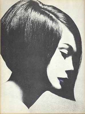
These were the two hairdressing sections, created by Level 3 Hairdressing. The first one, ‘Peek-a-boo’ wasn’t so exciting to me. On the programme it was described as “A range of precision cuts and contemporary colours inspired by the 1980s”

(own photograph)
My only problem with this section was that the pieces all seemed very similar. The cuts were all in a simple bob style and the colours were equally simple browns, blacks and bright platinum blondes. There’s no doubt these cuts were very well done, and I can’t deny that I can’t cut hair that precisely, but I found there wasn’t much diversity in these pieces, which was my disagreement with it.
I also think that the way the hair was presented was very distracting. The models were made up with huge lips and did a modern style dance that involved tilting the head and walking in rhythm in quite a military way. There was also a part of the dance where the models stood in a line, which obscured some of the styles, depending on where you were seated. I felt personally that this was very irrelevant to the hair on display, and made it hard to focus on the styles themselves.

The second hairdressing section was titled ‘Multi dimensional’. These pieces, according to the programme, were inspired by Vidal Sassoon, who “revolutionised the hairdressing industry in the 1960s”.

(own photograph)
 Compared to Vidal Sassoon’s work, these hairstyles were absolutely insane, but I understand their concept. The Hairdressing students were looking to recreate Vidal’s style of geometric shapes in the hair, but the students have truly taken it to the extreme to create a truly inspiring display.
 
(own photograph)
This was my favourite piece from this section. The sheer patience and attention to detail it must have taken to create all of these sticks of hair is outstanding. Once again, in comparison to Sassoon’s work, I can see the geometric influence.


---

The next piece I have chosen is from the Individual Final Collections by National Diploma Fashion Year 2. These two pieces are by Charlotte Burton, and are titled ‘Structured Flow’.


These pieces are titled ‘Structured Flow’, which suggests a controlled way of letting the fabric flow, which can be seen by the frills on both dresses, which flow as they walk, but within the conforms of the dress itself. However, the model on the left could barely keep up with the other model, as her dress was tailored so tightly at her ankles that she could only shuffle down the catwalk very carefully. This, in my opinion, didn’t allow the frills of the dress to ‘flow’ as well as the frills on the other dress. However, the way of holding back how quickly one can walk in a dress could easily be another way of structuring the flow of the fabric, which relates nicely back to the collection’s name.

---

The last piece I have chosen to review is ‘Milk and Cream’ – the wedding collection on display at the show. I have always been a fan of wedding dress design and styling, and the diversity that is on offer for anyone looking for a unique dress for a special occasion. These particular dresses were created by A2 and AS Textiles and were “inspired by their investigation of social class”.


In this collection, the diversity created by the investigation into social class was quite visible. Some dresses had a Victorian feel, with longer sleeves and a long skirt, while others were more modern, with a much shorter ‘party dress’ feel – lots of frills and a lot more skin on display. In one case, the skirt part of the dress had been tailored into trousers, which would easily suit the less feminine brides. I enjoyed this section the most for its display of diversity using such similar fabrics and purpose.

---

Overall, I found the fashion show very enjoyable. It was interesting to see how these students responded to their briefs, and I could easily see how the product related back to the theme, without having to see any development work. Though Fashion and Hair have never really been subjects I have much interest in, the fashion show gave me the inspiration to experiment with textiles more in my own work in future.


Chesterfield College - Arts Festival Essay

On Tuesday 21st June, we visited the Arts Festival at Chesterfield College. This show was displaying the work of the second years in Art and Design, Fashion, Graphic Design and Interactive Media. Much like the previous show, this featured accompanying sketchbooks and development work, but there were no artists accompanying their work.

Within the Art and Design course especially, there were a variety of specialisms shown. Some pieces were made with textiles, some painted. Some were more photographic or otherwise digitally created. In addition to this, some pieces were very transparent and sought to illustrate or advertise, where others had more emotional significance. In the Graphic Design and Interactive Media area, there were also a variety of specialisms – some work was heavily digital, some using more lens based media, and others taking a more traditional approach. All of these things further demonstrate how broad a creative course can be.

This show was split into rooms like the Manchester show, with an upstairs and downstairs and adjoining rooms for different courses. Work was displayed in the dome area, and on the walls surrounding it on both floors. My main problem with the Art and Design display on the bottom floor was the lack of flow it had. The layout seemed more like a maze, with a small corner shape allocated to each piece of work. It was sometimes very easy to miss work out because of this. This was not the case with the outer walls and the work in the upstairs rooms, which was laid out much more easily. However, in the Graphics/Interactive room, a lot of work was grouped together on the wall to save space, with sketchbooks in the middle, and a lot of the name labels were placed together, which made it hard to see who owned which work and book. For this reason, I have mostly featured work from the Art and Design area, as it was frustrating to have a limited choice for the Graphics area.

Interestingly, a lot of pieces outside of my usual comfort zone of photography and illustration caught my eye this time. I found some of the photographs to be not very well thought out and candid. While some of the pieces I am looking at have illustrative qualities, I was not so impressed by a lot of the illustrations I saw at the Arts Festival.

---

I am reviewing three pieces by Emma Scott, who is studying a Foundation Diploma in Art and Design. She created four pieces about body image, which I found really captivating when they caught my eye. All of these pieces, when hung on the wall like they were, were equally striking, and each one conveys the same message, but with a uniquely different delivery.
All three of these pieces are executed in very cold blues, whites and greys, which all give off a feeling of sadness and loneliness, which is often associated with body image issues. 

(own photograph)

This is the first piece in the series, and is easily the subtlest. No type is used in this piece. In terms of materials, this piece looks like it was made with inks and collage on some kind of board. The scratchy effect around the figure and in the collage that was made by the wood grain gives a strong message of desperation, like the artist is scratching desperately, trying to get out of this feeling of worthlessness that comes with low self-esteem. The way the scratches seem to frame the figure is reminiscent of a halo, which could symbolise how society glorifies the slim, beautiful people. The face that the model’s face is cut off could symbolise this further – that the artist has been forced to believe that nothing else matters beyond being beautiful and slim.
I could easily see how this piece could’ve stemmed from a life drawing class, with the focus on the body, as well as the skull that’s been drawn over the figure.

---

(own photograph)
 This is the second piece I have chosen from Emma’s work. This piece is much more type based, and follows the colour scheme of the previous piece very well. This piece looks almost entirely painted, based on the hurried brush stroke feel of the background. Over the top is the deeply emotional monologue of someone struck by terribly low self-esteem. What I like most of all about this is that the monologue isn’t solely focused on the feelings of one person, but it also focuses on the general opinions people have on body image – “The world would be a lot easier if people accepted people who look different”.
Behind the text, the portraits of people seem distorted in the strokes of paint and obscured by the text. This could be on purpose, to illustrate the idea of looking into the mirror and seeing a distorted image of yourself because of how you feel inside. 

---

(own photograph)

This is the last piece I have chosen to review. When I was walking through the Arts Festival, this piece was the one that caught my attention before the others. At first I wasn’t too sold on the inverted effect on the photograph, but I grew to like it more, as I noticed how much easier it was to read the type, and how it fits the cool colour scheme really well.
The eyes of the model easily emphasize how cold and desperate these emotions are, and their pure white colour makes them hard to avoid, forcing the audience to face up to the reality of this problem. Her hair also helps draw the eye into the face, as it’s a basic white colour almost all over. As for the writing on her face, I think this is especially interesting, and could easily be influential to anyone who has felt this way before, or is still dealing with these issues.
I also like the ‘focus’ shots around the photo, which highlight phrases from the face. The bottom one – “What Makes You Different Makes You Beautiful” – is my favourite. The shot is put together very well, and the eye is drawn to the text first. The choice to crop this down to just the nose and mouth gives the impression that the model could be anyone, which makes the message even more accessible to the audience.

---

Overall, I found the Arts Festival to be very interesting and inspirational. Some work wasn’t as exciting as it could be, but other pieces were immediately eye catching and stayed with me long after I left the festival. I really look forward to creating work at this standard or higher myself in my second year, and I know that the Arts Festival has given me the motivation and insight to competently compete with students like these when it comes to applications for jobs and universities. 

Manchester Metropolitan University – Degree Show Essay


On Monday 20th June I visited the Manchester Metropolitan University with my college. At the university, we visited a degree show that showcased the work of degree students studying a variety of design and art based courses, including Fine Art, Illustration and Animation, Interior Design and Graphic Design. Along with the pieces I will talk about were development sketchbooks and artists to speak to, to give more depth to the work.

A variety of specialisms were showcased to show the variety available within the courses. Within the Textiles course, for example, were some very illustrative pieces, as well as more print based work. Some work featured type also. These pieces are just examples of how broad the work can be through any of the courses, which was something I was very happy to see and very interested in.

The show was arranged by course, with labels on most of the doors to denote which course was being exhibited where. There was a map included with this to make finding the work most relevant to you easier. However, I found this very confusing. On the map, I had chosen to look for Illustration and Animation, as illustration is something I am interested in, but when I headed up to the floor, I found that a lot of what I was looking at was not what I had expected to find. I do appreciate that a lot of work on these courses is a broad mix of techniques and subjects, but it was very difficult to find what I was really looking for at first.
I also found that the labelling for the images was slightly confusing. In one particular area of work, supposedly showcasing Art and Design students, the title under one of the artist’s names read ‘BA (Hons) Religion and Ethics’, which

As my interests lie quite strongly with both photography and illustration, these were the areas I took most interest in, while I did still look at and appreciate other areas of the exhibition. I was also very surprised at how much of the Textiles show I was interested in, as a lot of the pieces featured designs I was really inspired by.

---

The first piece I am looking at is by Alan Ryan, studying a degree in Textile Design. His work was interesting to me because of the focus on anatomy he uses. This photograph of the postcard I picked up of his work doesn’t do it much justice, but his work features lots of calm neutral colours and anatomical references.

(own photograph)
I looked to Alan’s blog for some insight into where his ideas had come from, but sadly it’s almost totally empty. However, I could find more of his work in the form of designs and drawings, both focused on anatomy. I can see where Alan’s first ideas could have come from very easily – from life drawing with focus on muscles and from possibly looking at Da Vinci.

This seems to be the piece Alan used to develop into his final design that was printed on the postcards. In his work, I can see a lot of similarity to the anatomy drawings Leonardo Da Vinci created. Da Vinci’s work features the same outlined muscles in conjunction to the drawing of the figure. The colours used, the cool neutrals, are also something that Alan has used in his work.


Also, the chain used in place of the spine in Alan’s drawing is very intriguing to me. It could easily be a statement on human life in many ways. It could be a symbol of how human beings are just machines to do tasks of others (bosses, Gods, etc). It could be a statement on how the body functions like clockwork until one thing goes wrong like a spanner in the works. The possibilities for multiple interpretations are endless and this is a feature I love in any artwork.
Alan’s work combines the simplistic style of composition (he has not added anything to the drawing that doesn’t need to be there) with the extremely complex and precise art of drawing the body and that is something I admire greatly.

---

The next artist I am looking at is Catherine Parsonage. Her work on display, ‘What We Talk About When We Talk About Love’ was easily the piece I loved the most in the whole exhibition.


In the exhibit, this was a series of 3 or 4 pieces, all of which featured something very clinical (one was in what appeared to be a hospital, for example, while the above one features a hospital bed). While this is a painting, I find it interesting for its illustrative quality – the style, the colour scheme and the line quality, as well as the symbolism and the emotions behind the work.
There was no development work on show along with these pieces, and Catherine was not there to speak to me. She also lacks a blog to show her influences, but I have emailed her asking about the paintings I have looked at, and she was happy to give me an insight into her thoughts in creating this piece. All the paintings in her ‘What We Talk About When We Talk About Love’ series are about mortality and medicine, and our experiences of it. The pieces illustrate medicine’s ability to support and restrain – medication and treatment easily has side effects that can be just as devastating as illness itself, along with the miracles modern medicine creates. Catherine has used the background of her pieces to illustrate a psychological space that, combined with the recognisable hospital equipment, is made to create a personal emotional response with the viewer. Catherine claims her ultimate goal is to illustrate how we as people view the clinical environment in so many different ways, and her work depicts the hospital environment in an unpredictable world that is like an alternate reality that we can never visit.
If you search the title of these works in a search engine, you will come across a book with the same name. The story is a simple one about some friends sitting around a table discussing what true love really is, but with some very sombre themes. The one particular piece that stands out is a story told in the book about an old couple who are in a car accident and end up in hospital together, both in full-body plaster so they can’t move. The man and woman are unable to even look at each other in the casts, which breaks their hearts. This could be the significance in the hospital bed seen above, as it seems to be on a cliff side, symbolising both the sheer distance they are feeling between each other, and the fact that in their eyes, one of them could easily vanish (fall off a cliff) and the other would be none the wiser in their inability to move.
I absolutely adore this work. I feel that it is very easily relatable, and brings about an emotional response in me that is entirely my own. While the piece is done in oil paint, I could easily see it translated into watercolour with as much ease.

---

The last artist I am reviewing is Zoe Boston, a photographer from the exhibit. Her photo ‘An Unwanted Gift’ was very interesting to me.


Zoe does not have a blog, or any development work along with this, so instead I researched the drug she has photographed. Methotrexate is the drug, and is used to treat psoriasis, arthritis and some cancers. It is considered highly dangerous, to the point where the patient is not allowed to take one tablet per day for fear of death. There are lots of risk factors and reasons to check before taking it, in a way that can make it extremely terrifying.
This piece made me think in a stop-and-stare way, where I was unable to take my eyes off of this photograph. I don’t know the artist personally, so I have no idea if she suffers from a condition and takes this medication, but I feel like there’s a deep connection between artist and subject. The black liquid (which looks a lot link ink) could symbolise the negative view the artist has on the medication, hidden behind the veil of the information given (the text on the photograph). The way the tablets are bagged to contain all of the liquid and the tablet container could be a way of symbolising how the health system protects such a dangerous medicine. If this medicine was for a relative of the artist, the bag could symbolise her inability to stop the relative taking it – medicines are kept away from children.
I really love this work for the emotional feeling it gives me – one of sadness and fear, coupled with clinical sombreness. I think it is a very interesting and well made piece, and the monotone colour scheme, punctuated by the single bright red colour of the tablet container immediately draws the eye where it’s needed.

---

Overall, I found the exhibition both interesting and frustrating in equal measure. I found that a lot of the colour schemes were very influential to me – I took many photographs and will probably try out some of the colours in my future works. However, the layout of the exhibit was off-putting and made it harder to enjoy the works.
Some of the work was really inspiring, using techniques, colours and subjects that really interested me. In the case of Catherine Parsonage, I felt the need to speak to her about her work and fully understand it, as I found it extremely interesting to look at, and found the emotional response I had was very profound.
However, there was a lot of work I was left not so inspired by. This is probably because I lacked the understanding to fully appreciate it, and there was no insight in some areas to assist me (some of the work I found the hardest to understand was alone with no sketchbooks or artists nearby).
I can still appreciate the time and effort that has gone into the work featured in the show, even if it doesn’t cater to my own personal taste.

Tuesday 7 June 2011

Ben Nicholson, Techniques and Processes

Ben Nicholson is an abstract painter who uses collage in muted colours and shapes. His work features a variety of textures and colours, which give different feels. He uses oil paint, along with materials like gesso (a primer-like substance that gives paper and canvas a more strengthened feel, and adds texture) and pencil, with collage to create his work.
I looked at Ben's art for inspiration when creating my final collage in life drawing. i used the following pieces mainly as a reference for colour, texture and shapes:


I created my collages with glue, tissue paper, brown paper, black paper, pastels and blue ink. I used the tissue to imitate the textures Ben creates with gesso, oils and the layers of collage he uses. I followed his colour scheme with brown, black and blue. To imitate the first image better, I could have used newspaper, but I was wary of adding too much to my collage and making it too busy. To imitate the second image, I left some white space and added my geometric-style lines in blue and black to highlight parts of the body. I also tried to lay my black and brown paper at angles to achieve this effect.