Showing posts with label college. Show all posts
Monday, 19 December 2011
Graphic Novel Review - Gonzo: A Graphic Biography of Hunter S. Thompson
I chose this graphic novel because of my love for Hunter S. Thompson's work. By no means am I his biggest fan, but I love his writing style and his way with words enough to read (and re-read) as many books as I can get my hands on. So to me, this book was a must immediately.
The book's cover design jumped out at me as being very reminiscent of the Fear and Loathing in Las Vegas book cover, with a bright orange background and a sketchy illustration below. This doesn't really surprise me, as Fear and Loathing is easily Thompson's most famous book, and this is a very easy way of sucking readers of that book into reading this one - one which will definitely inform them of what a fantastic writer they have stumbled upon.
As I read the book, I couldn't help thinking that it was very well put together. The book is written as if Thompson had written it himself, and includes quotes and snippets from his various books. The writing and the snippets fit together perfectly to make a very seamless portrayal of Thompson's life, that genuinely feels true to his style. Thompson's style of writing (in my opinion) is very recognisable - he had a way to describe even the grittiest elements of society in an obscure way that seemed to make caricatures of them, which is a style I admire greatly.
In terms of illustration, I think the book's visuals complement the story well. A combination of realism and sketchiness, it relates back to the nature of Thompson's journalism - rapidly flashing from place to place, sketchy and unfinished in places.
However, I do think the monochromatic images were a bad choice. They give the book an 'old timey' feel which doesn't really suit Thompson's style as a person. The bizarre nature of Thompson's descriptions paves the way for bizarre renditions of people in bright colours and strange shapes, but this book has not played into that.
Overall, I really enjoyed this novel, as it was a really captivating insight into the life of a writer I admire. The illustrations and words have come together well to portray an immersive journey through Hunter S. Thompson's life. I can't help but appreciate this novel for what it is, as it was a joy to read, so much so I read it twice. I could definitely see this graphic novel paving the way for new Thompson fans to discover more of his great work.
Saturday, 25 June 2011
Chesterfield College/Winding Wheel - Fashion Show Essay
On Tuesday 21st June, I visited the Fashion Show at the Winding Wheel. This show was designed to show the work of students on the Fashion, Hair and Beauty, Textiles and Art and Design courses. Because of the nature of the show, I didn’t get to see any development work, and it was very hard to speak to the designers and artists who created the work.
This show was quite restricted in terms of the specialisms it could display. Creatives worked with fabric or hair, and usually to a theme, with not much room for expansion. There was some variation in the pieces, but they all recognisably ran on the same theme. The show was divided into projects that would be shown, so the audience could easily relate the work back to the theme it was based on, though sometimes this was quite obvious because of the work on show, or the accompanying music (‘Get Me To The Church on Time’ played during the wedding segment).
In terms of layout, the show was very different from the other two. Where the others were free roaming shows where visitors were free to walk where they pleased and spend as long as they liked looking at (and photographing) the work they loved, the fashion show was much more structured, and work was only on display for a few minutes at a time, so photographers had to be vigilant.
The show was arranged as a catwalk down the centre of the room, with seating around, and a dressing room away from the main stage, that lead onto a red carpet up to the catwalk itself. I liked this layout considerably more than the previous shows, because this left no room for us to miss any of the work on display. I did find, though, that the bright stage lights used to light the models was very interfering and washed out my photos considerably, making the work I chose to photograph very hard to make out in places.
Because of the nature of the show, it was hard to select pieces relevant to my usual specialist subject interests, so instead I have chosen to review the pieces that interested me the most.
---
These were the two hairdressing sections, created by Level 3 Hairdressing. The first one, ‘Peek-a-boo’ wasn’t so exciting to me. On the programme it was described as “A range of precision cuts and contemporary colours inspired by the 1980s”
| (own photograph) |
My only problem with this section was that the pieces all seemed very similar. The cuts were all in a simple bob style and the colours were equally simple browns, blacks and bright platinum blondes. There’s no doubt these cuts were very well done, and I can’t deny that I can’t cut hair that precisely, but I found there wasn’t much diversity in these pieces, which was my disagreement with it.
I also think that the way the hair was presented was very distracting. The models were made up with huge lips and did a modern style dance that involved tilting the head and walking in rhythm in quite a military way. There was also a part of the dance where the models stood in a line, which obscured some of the styles, depending on where you were seated. I felt personally that this was very irrelevant to the hair on display, and made it hard to focus on the styles themselves.
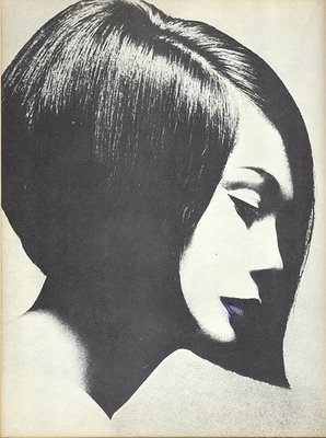
The second hairdressing section was titled ‘Multi dimensional’. These pieces, according to the programme, were inspired by Vidal Sassoon, who “revolutionised the hairdressing industry in the 1960s”.
| (own photograph) |
Compared to Vidal Sassoon’s work, these hairstyles were absolutely insane, but I understand their concept. The Hairdressing students were looking to recreate Vidal’s style of geometric shapes in the hair, but the students have truly taken it to the extreme to create a truly inspiring display.
![]() |
| (own photograph) |
This was my favourite piece from this section. The sheer patience and attention to detail it must have taken to create all of these sticks of hair is outstanding. Once again, in comparison to Sassoon’s work, I can see the geometric influence.
![]() |
---
The next piece I have chosen is from the Individual Final Collections by National Diploma Fashion Year 2. These two pieces are by Charlotte Burton, and are titled ‘Structured Flow’.
These pieces are titled ‘Structured Flow’, which suggests a controlled way of letting the fabric flow, which can be seen by the frills on both dresses, which flow as they walk, but within the conforms of the dress itself. However, the model on the left could barely keep up with the other model, as her dress was tailored so tightly at her ankles that she could only shuffle down the catwalk very carefully. This, in my opinion, didn’t allow the frills of the dress to ‘flow’ as well as the frills on the other dress. However, the way of holding back how quickly one can walk in a dress could easily be another way of structuring the flow of the fabric, which relates nicely back to the collection’s name.
---
The last piece I have chosen to review is ‘Milk and Cream’ – the wedding collection on display at the show. I have always been a fan of wedding dress design and styling, and the diversity that is on offer for anyone looking for a unique dress for a special occasion. These particular dresses were created by A2 and AS Textiles and were “inspired by their investigation of social class”.
In this collection, the diversity created by the investigation into social class was quite visible. Some dresses had a Victorian feel, with longer sleeves and a long skirt, while others were more modern, with a much shorter ‘party dress’ feel – lots of frills and a lot more skin on display. In one case, the skirt part of the dress had been tailored into trousers, which would easily suit the less feminine brides. I enjoyed this section the most for its display of diversity using such similar fabrics and purpose.
---
Overall, I found the fashion show very enjoyable. It was interesting to see how these students responded to their briefs, and I could easily see how the product related back to the theme, without having to see any development work. Though Fashion and Hair have never really been subjects I have much interest in, the fashion show gave me the inspiration to experiment with textiles more in my own work in future.
Chesterfield College - Arts Festival Essay
On Tuesday 21st June, we visited the Arts Festival at Chesterfield College. This show was displaying the work of the second years in Art and Design, Fashion, Graphic Design and Interactive Media. Much like the previous show, this featured accompanying sketchbooks and development work, but there were no artists accompanying their work.
Within the Art and Design course especially, there were a variety of specialisms shown. Some pieces were made with textiles, some painted. Some were more photographic or otherwise digitally created. In addition to this, some pieces were very transparent and sought to illustrate or advertise, where others had more emotional significance. In the Graphic Design and Interactive Media area, there were also a variety of specialisms – some work was heavily digital, some using more lens based media, and others taking a more traditional approach. All of these things further demonstrate how broad a creative course can be.
This show was split into rooms like the Manchester show, with an upstairs and downstairs and adjoining rooms for different courses. Work was displayed in the dome area, and on the walls surrounding it on both floors. My main problem with the Art and Design display on the bottom floor was the lack of flow it had. The layout seemed more like a maze, with a small corner shape allocated to each piece of work. It was sometimes very easy to miss work out because of this. This was not the case with the outer walls and the work in the upstairs rooms, which was laid out much more easily. However, in the Graphics/Interactive room, a lot of work was grouped together on the wall to save space, with sketchbooks in the middle, and a lot of the name labels were placed together, which made it hard to see who owned which work and book. For this reason, I have mostly featured work from the Art and Design area, as it was frustrating to have a limited choice for the Graphics area.
Interestingly, a lot of pieces outside of my usual comfort zone of photography and illustration caught my eye this time. I found some of the photographs to be not very well thought out and candid. While some of the pieces I am looking at have illustrative qualities, I was not so impressed by a lot of the illustrations I saw at the Arts Festival.
---
I am reviewing three pieces by Emma Scott, who is studying a Foundation Diploma in Art and Design. She created four pieces about body image, which I found really captivating when they caught my eye. All of these pieces, when hung on the wall like they were, were equally striking, and each one conveys the same message, but with a uniquely different delivery.
All three of these pieces are executed in very cold blues, whites and greys, which all give off a feeling of sadness and loneliness, which is often associated with body image issues.
![]() |
| (own photograph) |
This is the first piece in the series, and is easily the subtlest. No type is used in this piece. In terms of materials, this piece looks like it was made with inks and collage on some kind of board. The scratchy effect around the figure and in the collage that was made by the wood grain gives a strong message of desperation, like the artist is scratching desperately, trying to get out of this feeling of worthlessness that comes with low self-esteem. The way the scratches seem to frame the figure is reminiscent of a halo, which could symbolise how society glorifies the slim, beautiful people. The face that the model’s face is cut off could symbolise this further – that the artist has been forced to believe that nothing else matters beyond being beautiful and slim.
I could easily see how this piece could’ve stemmed from a life drawing class, with the focus on the body, as well as the skull that’s been drawn over the figure.
---
![]() |
| (own photograph) |
This is the second piece I have chosen from Emma’s work. This piece is much more type based, and follows the colour scheme of the previous piece very well. This piece looks almost entirely painted, based on the hurried brush stroke feel of the background. Over the top is the deeply emotional monologue of someone struck by terribly low self-esteem. What I like most of all about this is that the monologue isn’t solely focused on the feelings of one person, but it also focuses on the general opinions people have on body image – “The world would be a lot easier if people accepted people who look different”.
Behind the text, the portraits of people seem distorted in the strokes of paint and obscured by the text. This could be on purpose, to illustrate the idea of looking into the mirror and seeing a distorted image of yourself because of how you feel inside.
---
![]() |
| (own photograph) |
This is the last piece I have chosen to review. When I was walking through the Arts Festival, this piece was the one that caught my attention before the others. At first I wasn’t too sold on the inverted effect on the photograph, but I grew to like it more, as I noticed how much easier it was to read the type, and how it fits the cool colour scheme really well.
The eyes of the model easily emphasize how cold and desperate these emotions are, and their pure white colour makes them hard to avoid, forcing the audience to face up to the reality of this problem. Her hair also helps draw the eye into the face, as it’s a basic white colour almost all over. As for the writing on her face, I think this is especially interesting, and could easily be influential to anyone who has felt this way before, or is still dealing with these issues.
I also like the ‘focus’ shots around the photo, which highlight phrases from the face. The bottom one – “What Makes You Different Makes You Beautiful” – is my favourite. The shot is put together very well, and the eye is drawn to the text first. The choice to crop this down to just the nose and mouth gives the impression that the model could be anyone, which makes the message even more accessible to the audience.
---
Overall, I found the Arts Festival to be very interesting and inspirational. Some work wasn’t as exciting as it could be, but other pieces were immediately eye catching and stayed with me long after I left the festival. I really look forward to creating work at this standard or higher myself in my second year, and I know that the Arts Festival has given me the motivation and insight to competently compete with students like these when it comes to applications for jobs and universities.
Subscribe to:
Posts (Atom)